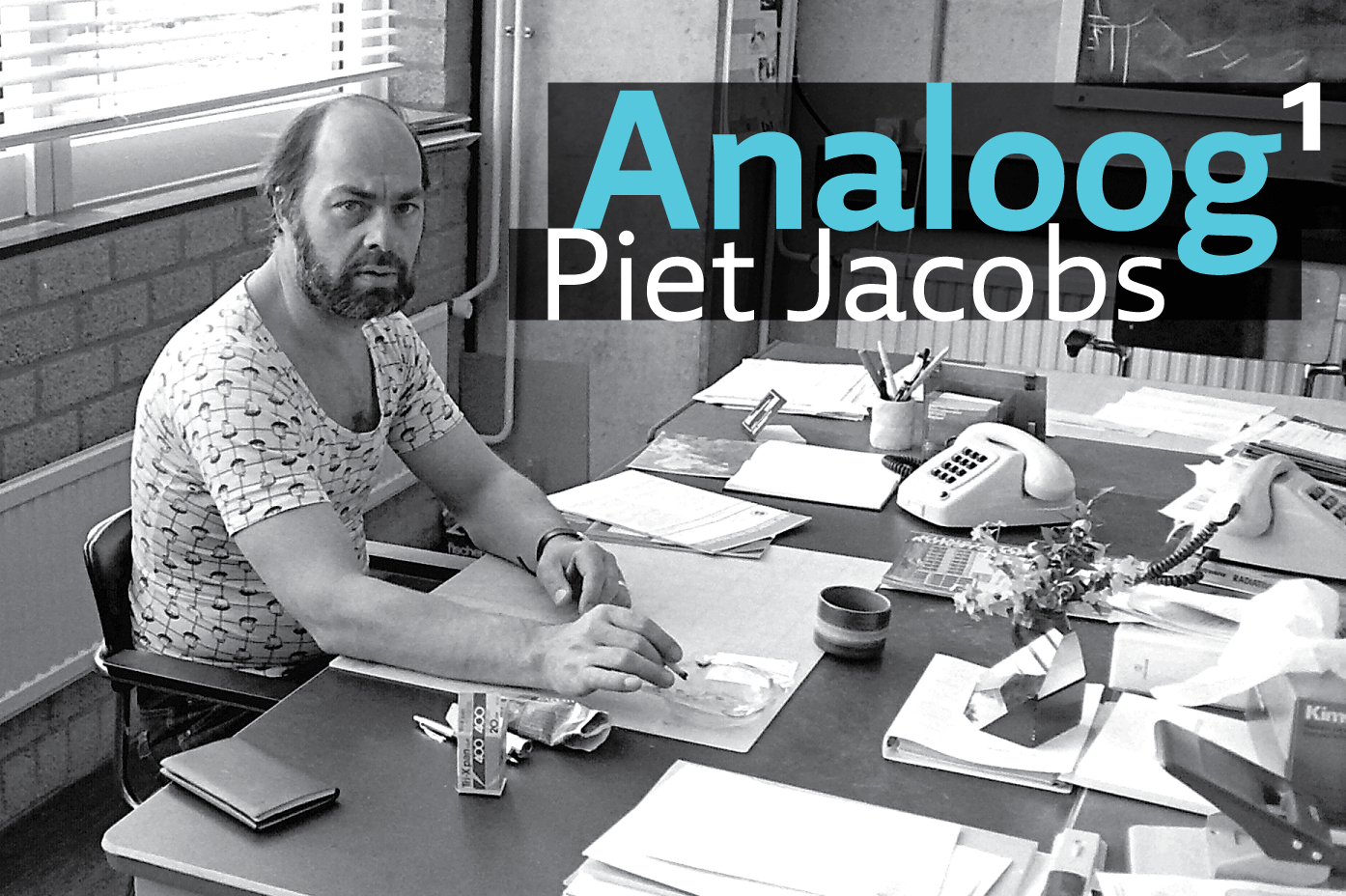
Analoog #1: Interview with Piet Jacobs
I met Piet Jacobs in November 2017, during the Dutch ‘art of the book’ fair (Boekkunstbeurs) in Leiden. He was in one of the stands, selling a compelling selection of fine Dutch type specimens and booklets. I noticed among them A tot Z, the rare autobiography of Paul H. Rädisch, the famous punchcutter of Jan van Krimpen’s typefaces. After a brief conversation, I purchased the book—a fine green clothbound volume.
It was only when had I arrived home and had time to begin reading that I realised Piet was the editor, printer, and bookbinder of the publication. That was unexpected! I later found out that he had worked for many years at the prestigious Joh. Enschedé type foundry. I wanted to find out more about Piet and his experiences there, so I got in touch with him and made arrangements to visit his house in the Boerhaavewijk district of Haarlem.
Please give us some biographical information about yourself: Are you from Haarlem? How did you enter the graphic trade?
I was born in Haarlem; I have always lived and worked here and will stay here until the end. My uncle worked at the Joh. Enschedé, and, since I did not want to finish school but wanted to earn money, I started working as a warehouse clerk at the letter foundry.
You were an employee of Joh. Enschedé from 1959 to 2004. Can you tell us about this period and your role with the company?
During the first twenty years, I worked as a warehouseman, brass rules operator (koperenlijnenbewerker), shaver (schaver), typefounder, and engraver. At some point, the sale of lead types declined to such an extent that most of the personnel were transferred to other departments. I left the type foundry in 1979 and, in March of 1984, it was annexed to Het hof van Johannes, a department within Joh. Enschedé that ‘aimed to keep the old typographical techniques alive’. At this time, we had to perform any kind of work that was needed.
My last task at Enschedé’s foundry had been to cast the 14pt Romanée italic. After that, I was offered a job as supervisor of the Rijkswaarde II department, where ladies checked rolls of postage stamps. After one year, I had enough of this and was asked by the head of the laboratory if I would like to work in the photo lab. The work there, commissioned by DNB (De Nederlandsche Bank), consisted of investigating the counterfeiting of newly designed banknotes. During this time, I had a lot of contact with DNB (De Nederlandsche Bank), CRI (Central Investigation Information Service), Interpol, and local police forces.
Henk Drost had retired early, after forty years of employment, and the relocation of the Klokhuisplein building to the new one in the Waarderpolder was in the final stages. The director of Enschedé, Karel Schell, asked me if I wanted to supervise the move, and I did so, with pain in my heart. Historical material and the typefaces of the foundry were all put in boxes, and the whole building had to be vacated to transfer it to the Municipality of Haarlem–which had bought the land the foundry had stood on–for urban development.
Later, the rise of color copying machines made the forging of money much easier, and the DNB decided that counterfeit investigation was no longer necessary. I then moved to inspecting the paper and inks used in the manufacture of banknotes. In the meantime, Enschedé had ended up in heavy weather, and one reorganisation followed another. The Lab was also reorganised and my position ended. After being put on stand-by for a year, I was placed in the stamps printing section. Here I became a warehouse manager. I retired after 45 years.
Can you describe the function of ‘brass rules operator’ (koperenlijnenbewerker) and ‘shaver’ (schaver)? They can’t be easily translated into English.
Yes, at the Enschedé’s type foundry, the letters were cast to a height of approximately 25.50 mm. Then they were shaved to the Dutch type height (24.85mm) and stored in the warehouse. This work was done with planning benches and a machine height bench. If an order came from abroad, the types had to be put on the bench again and then adjusted to the type height used in the country of destination, which was a lot of work. The function of schaver was therefore very important, because everything had to be at the right height.
At the Lettergieterij Amsterdam-Tetterode, things were done differently and the letters were cast at its final height.
A brass rules operator made all the brass rules, corners, dashes, braces, etc., using different machines for each part of the process. That person had to be dexterous at planning as well, shaving the brass strips that were ordered at a German brass line factory as raw material and delivered at a standard length of c. 50 cm in their respective thicknesses. The range of thicknesses we would order typically covered 1-2-3-4-6-8-10-12-16-18-24-36 and 48 points. The first thing to plane into these strips was a pattern or image—fine lines, blunt-fine lines, semibold and bold lines, and so on, in countless variations. Subsequently, they had to be planned to Dutch height, and were then ready for further treatment. The strips were cut to lengths that were useful to typesetters and delivered in sets. The line lengths were 6–20 points and 2–24 augustijn (Dutch for cicero).

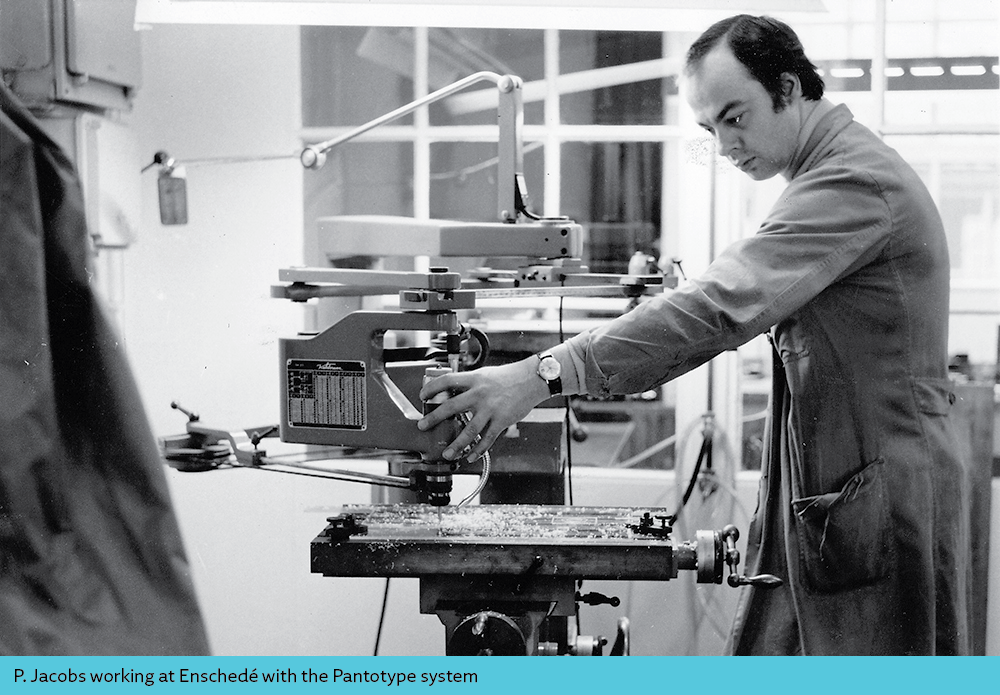
What about your engraving work? Was it done with Enschedé’s Pantotype machine?
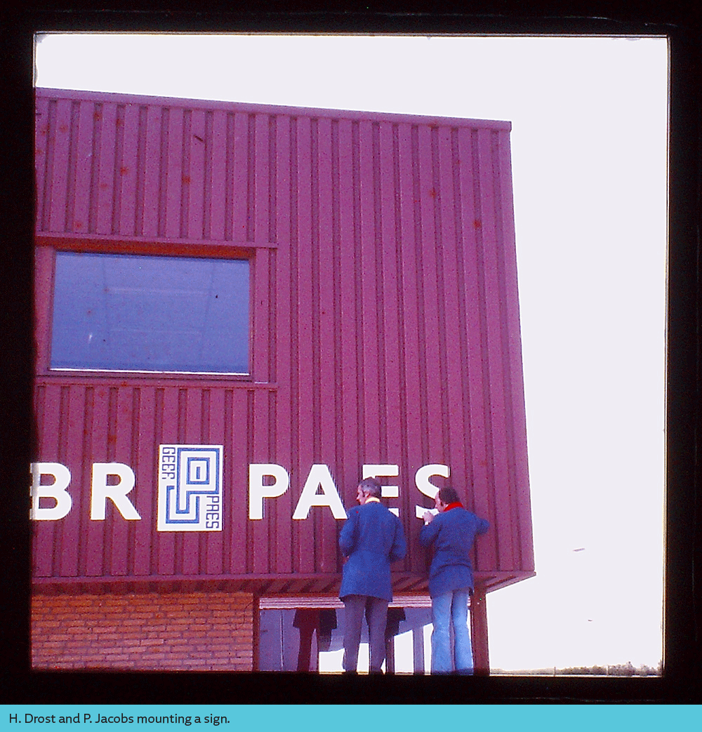
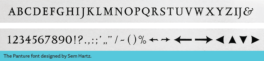
Yes, the work consisted mainly of engraving signs and nameplates for hospitals, town halls, etc., using the Pantotype machine. Henk Drost also worked with me installing the signs onsite. The alphabet we used was Panture, a beautiful font designed by Sem Hartz specifically for this use. Later, Gerard Unger designed Markeur, a sans-serif letter that could be engraved much faster. Markeur was the first alphabet that G. Unger designed.

I once went to the DNB’s building to photograph Sem Hartz’s metal lettering made with a version of the Panture font. Was the Pantotype system successful? Was there enough work for it?
The alphabet Sem Hartz designed for the DNB was different from Panture, and its production was also very different. His Panture was applied to a limited extent. This was due to the labor-intensive work that its manufacture required; thus the price. G. Unger’s Markeur was used more often. After a few years, more engraving machines came on the market. Although they delivered poor typography, they were much cheaper, so there was little work for the Pantotype system.
Paul H. Rädisch retired in 1957. You knew him very well. Can you tell us about your relationship with him and how you came to publish his autobiography?
I had my own press and wanted to publish a sensible story. Henk Drost regularly visited Rädisch, so I asked him if he would ask Rädisch to write down his experiences at Enschedé. Rädisch accepted and began writing. My contact with him came afterwards; checking the text that I was going to print for his Dutch needed many edits.
What about this funny story in circulation saying Rädisch sabotaged a punch-making pantograph Enschedé had purchased? Did you ever hear this story at Enschedé?
No, I have never heard about this story, and as far as I know, this does not fit the character of Rädisch at all.
I did not know him for long, but, according to my experience, he was a very nice person, as was his wife. He also drew and painted, but you must remember that, during the period that I spoke to him, he was already into his eighties. The impetus and enthusiasm of his youth had, by that time, been diminished.

You already told me you worked with Henk Drost, Rädisch’s apprentice. Was there still punchcutting work for him after Rädisch left, or did he have to do other kinds of metal engraving?
Henk Drost had cut some punches, but these were punches from existing typefaces that had become damaged. No more new typefaces were produced in this very expensive and laborious way. Technical developments had overtaken both the profession and the casting of letters.

Were you his friend? Is there anything you can you tell us about him? I’ve always though it was a pity he didn’t train anyone and that his expertise died with him.

Yes, we were friends. Henk was a very trustworthy person; perhaps a bit too formal. Some people perceived him as distant, but he certainly was not. He was always ready to help everyone, whether it was engraving or another job. Henk was a jack-of-all-trades—he could do almost anything and, at Enschedé, that quality was often taken advantage of.
I think that Henk regretted that he could not pass on his knowledge, but economic circumstances did not allow for it. In order to keep the foundry going, he also had to perform other activities.

You also worked with Bram de Does. What was it like to work with him? Were you also friends?
Bram de Does was a typographer at Enschedé and he often visited the letter foundry. He was also a hobby printer—Spectatorpers was his own private press—and he considered Romanée by Jan van Krimpen the most beautiful typeface. We were good friends.

You once told me that you had been interested in learning punchcutting but you never did? Why? You surely had the opportunity to watch Henk Drost at work and learn some techniques from him.
I wanted to cut an original typeface for De Priegelpers, my own private press, but I later realised that this was too ambitious. Finishing it would have been impossible. Furthermore, there were already enough beautiful scripts, so I chose to print with Romanée.


Can you tell us more about De Priegelpers? You started printing for yourself while you were still working at Enschedé. Was it difficult being limited to only printing in your free time? How many titles have you published?
Playing with letters was my hobby, so that was a good way to spend my free time. Books that I have printed are:
• Persbericht. First edition at De Priegelpers. 1976. Printed with Baskerville (I hadn’t yet purchased Romanée).
• A tot Z. Een autobiografie van P. H. Rädisch. 1979. Printed with Romanée.
• Druk. At daughter’s birth. 1981. Printed with Romanée.
• Langs oeroude banen. A collection of priapean by Saul van Messel. 1986. Jaap Meijer. Printed with Romanée.
• Grind. Poems by Johan Lamboo. 1989. Printed with Romanée.
• Thomas de Vechter, a Leyden typefounder around 1600. 1990. Written by R.M.Th.E. Oomes. Printed with Romanée.
• Niet Vergeten, Speeches on the death of Peter Horvath in 2002. 2008. Printed with Romanée.
• De Hun van Paradiso. Poems by Jozsef Horvath, 10 years after his death. 2016. Printed with Romanée.
(Note: In case you are interested in purchasing De Priegelpers’ books, you can order them by emailing jacobspieter44 at planet.nl)
Furthermore, I contributed to many joint projects of Drukwerk in de Marge (the Dutch association of private presses). In these projects, I printed with Romanée, Fleischman, and Marina typefaces.

How did you decide what to publish? Did you have an advisor, or were you just following your personal tastes and preferences? Do you still have time to print occasionally?
No, I did not let anyone advise me as to what I was going to print. I had to find it worthy myself. Maybe that’s why I’ve printed so little—there were not that many texts that I found interesting enough. Also, a bit of lack of commitment on my part and the fact that I’m a lazy printer, especially now that my jobbing press is not in good condition and I always have to bother someone else for printing. Now when I want to print something, I use the press of Rob Over de Linden, a colleague and friend from Hoofddorp who runs the Ovira Linda press.
Would you be interested in authorising an English translation of Rädisch’s autobiography? Do you think it could be of value for a wider public?
I would appreciate it, provided I approve its implementation. But personally, I think that only a very limited group would be interested in such a translation.
Well, I found Rädisch’s autobiography fascinating, and I think a lot of people in the typographic community would be interested in such a book. Let’s hope a good publisher is taking note.
Interview: Ramiro Espinoza.
Edition: Rod McDonald & Tamye Riggs.
With special thanks to Jan Middendorp, who helped to translate difficult passages.


Comments
Fascinating and intriguing article. Maybe you should offer it s an article to the Boekenwereld.
Thanks for the great content! I wish he could talk a little bit more not so briefly. And definitely I am interested in the Rädisch’s autobiography!!!
fascinating to read and it brings many memories back
Very interesting indeed! Well written and it screams for more on the subject.
Sorry, comments for this entry are closed at this time.