Introducing Guyot Press
In May 2017, Retype Foundry released Guyot Headline; a few months later the family was expanded with Guyot Text. Designer Ramiro Espinoza was praised for drawing a sharp and economical type family that combined the elegance of its historic model with contemporary dynamism and efficiency. Inspired by French punchcutter François Guyot’s 16th-century typefaces, the Guyot family was well received by colleagues and clients alike, and in early 2018 it was awarded a Certificate of Excellence by the Type Directors Club.
Today the Retype Foundry introduces Guyot Press. As its name indicates, the new sub-family is optimized for a specific purpose: meeting the needs of contemporary newspaper design.
In developing Guyot Press, Espinoza drew on his past activity as an in-house newspaper designer. His experience with newspaper production complexity led to various decisions regarding proportions and detailing. To allow a higher density of lines without reducing legibility, Guyot Press was given a much taller x-height and shorter extenders. With their sharp and sturdy appearance, its characters remain legible even when printed at small sizes.
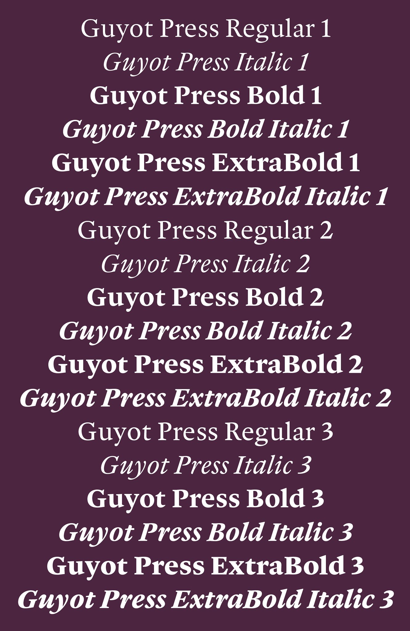
In order to compensate for varying ink-gain and newsprint’s demanding printing conditions, Guyot Press offers three series of subtly different weights and increasing robustness. This carefully structured grading system can be used by editorial designers to fine-tune their pages and achieve the desired final type density no matter the press or paper employed. Its generous counters and crisp serifs make Guyot Press an excellent choice for websites and device screens, too.
Guyot Press is fully equipped to tackle complex, professional typesetting. Its character set includes small caps, fractions, alternate designs, ligatures, swash capitals, case-sensitive forms, fleurons, and eight sets of numerals. Besides standard Latin, its extensive character set supports Central European, Baltic, and Turkish languages. Likewise, the number of characters has been expanded to include two series of circled numerals and more embellished leaf and bullet designs.













Comments
1 Trackbacks/Pingbacks
Sorry, comments for this entry are closed at this time.