Medusa at Behance
We have published a project at Behance covering our latest Medusa script in depth. Check it out, there are great new images of Medusa in use. The rest of ReType projects can be found here.
… > Read article
We have published a project at Behance covering our latest Medusa script in depth. Check it out, there are great new images of Medusa in use. The rest of ReType projects can be found here.
… > Read article
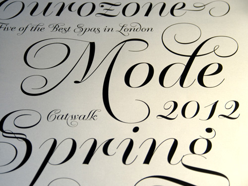
We are pleased to share that the website Graphicdesign.com has published a nice article/interview on Medusa and other ReType’s typefaces.
… > Read article
Our script Krul has been chosen among “Best of 2012” typefaces by Typographica.org. This is one of the most important type design prizes and we are exultant. And Winco and Dulcinea are also listed as “Honorable mentions”. Thanks to Laura Messeguer for reviewing and Typographica’s team for the support.
… > Read article
New from ReType, Medusa is Ramiro Espinoza’s homage to one of the most renowned masters of Spanish calligraphy, Ramón Stirling, who was active in Barcelona during the 19th century. Not much is known about his life, and there is even some doubt as to his real name, but his Bellezas de la Caligrafía (Beauties of Calligraphy) is one of the most exquisite English roundhand manuals ever produced.
The starting-off point in the creation of the typeface was an analysis of the histor … > Read article
Ramiro Espinoza has just been interviewed by Myfonts. I you want to know a little more over ReType, follow this link.
… > Read article
Next week is Type Amsterdam 2012. We are very exited and – certainly – a bit nervous 🙂
See you on Thursday.
… > Read article
Dulcinea is the title of Ramiro Espinoza’s in-depth look at Spanish Baroque calligraphy’s most extreme tendencies, and especially at some of those produced by the writing masters Pedro Díaz Morante and Juan Claudio Aznar de Polanco. These 17th and 18th centuries alphabets with their plentiful calligraphic flourishes represented a marked break with the harmonic and angular Renaissance Cancellaresca style.
It was Morante who first introduced and popularized the use of the poin … > Read article
Super font promo: during July you can buy at re-type.com the font families Kade and Winco with a very convenient 50% discount. Stay tuned for more interesting offers!
… > Read article
Ramiro Espinoza gives new details about his research on the origins of the ‘Krulletter’ and the life of the letter painter Jan Willem Visser in an article published by the website ‘I love Typography’.
Existe tambien una versión un tanto más extensa y en español publicada en la revista digital Monográfica.org
… > Read article
Studio Frog Design has released a nice promotional video featuring our Kurversbrug font combined with Underware’s Bello. Kurversbrug’s contours looks quite distorted like after being autotraced, which is a bit weird but… who cares!
… > Read article
German language version of Myfonts’s weblog has published a nice article about our recently published Krul typeface.
Thanks, Myfonts!
… > Read article
‘Krul’ is a typographic interpretation of the lettering style created by Dutch letter painter Jan Willem Joseph Visser at the end of the 1940s, which decorated the traditional brown bars of Amsterdam. In the beginning, these letters were strongly associated with the pubs connected to the Amstel brewery, given that Visser was the company’s official painter. As the years passed, the style became increasingly popular, and various business owners in Amsterdam and other Dutc … > Read article
Recently editorial designer Ariel Garófalo designed ‘Mujer’, a women’s magazines published by ‘Panamá América’ newspaper in Panama. The publication features our Lavigne Display and Lavigne Text and we are not ashamed to say they look terrific on the pages.
With a certain degree of reluctance we have created a Twitter account for ReType. You can follow us at:
https://twitter.com/#!/retypefoundry
… > Read article
Winco family can be labelled a humanist sans-serif, but in spirit it is more closely related to that rather rare typeface category called ‘glyphic’ or ‘incise’. Glyphic faces occupy a place roughly half-way between seriffed renaissance book faces and sans-serifs. The classic examples are Optima (Hermann Zapf) and Albertus (Berthold Wolpe), with Pascal (José Mendoza) sometimes mentioned as a more calligraphically inspired cousin to Optima. Instead of serifs, these types h … > Read article
Our font family Kade has been chosen by NL Graphic Design as the headline font for their new website. NL Graphic Design has grown out of the antiquarian department of Nijhof & Lee International Booksellers, and has one of the finest collection of original Dutch posters, catalogues, and books on typography available for sale. As Kade is bold and robust, we find it very well suited for this clean layout.
… > Read article
As every year I attended the Type]Media exhibition at the KABK in The Hague. It was nice to chat with the new graduates and learn about their projects and researches. Afterwards, there is always an alumni meeting and despite the dinner was not very well served thanks to a rather messy restaurant 🙂 , nobody actually cared much. Good company and juicy conversations were enough to keep everyone satisfied.
I made a Flickr’s Group with all the Type]Media’s posters but … > Read article
We just got the new Bath’s maps and they look great. Thanks FWDesign!
Spring has come with some new G-Star T-shirts featuring our Kurversbrug as their main motif.
… > Read article
More pictures of Bath’s new signage system have arrived. Higher resolution images can be found here.
When, in 2010, David Quay was asked by communication agency FWDesign to create a custom type family to be used as the new signage and orientation system of the City of Bath, he teamed up with ReType.
Bath is a beautiful city to design for, and we were delighted to be involved in the project. The process was intensive, and demanded a well-documented research into local values, history, and vernacular lettering tradition. We didn’t want a ‘squarish’ sans with a &# … > Read article
The Hague uses an interesting and original alphabet style in its street naming. It’s a typical ‘technical’ design, characterised by repetition of the same modules, and according to Albert-Jan Pool, related to DIN standards. Despite the ingenuity of its obvious typographic quirks, we like it; it’s part of the The Hague’s graphic and cultural DNA. For that reason, during our long wait for a new internet connection (thanks KPN!), we made up a digital ve … > Read article
I haven’t found as many graffitis in Buenos Aires as in the past, but anyway there are some good ones. This is located under a bridge in the intersection of ‘Crámer’ and ‘Elcano’ avenues. Check the artist’s website TEC and his Flickr account.
… > Read article
Being on vacation in Buenos Aires, I find impossible not to spend time spotting local lettering. This is the first batch.
On the Eerste Jan Steenstraat, in the Amsterdam neighbourhood of De Pijp, a group of houses has been renovated with their house numbers set in ornamental ceramic plates. We are gratified that, once again, our ‘Brugletter’ revival, Kurversbrug is being used in such a prominent position, and hope to see more of these plates in the streets of Amsterdam. Keeping alive Amsterdam’s best examples of letter-making tradition is one of our objectives, so we love to disco … > Read article
The leading fashion brand G-Star, in exploring the rich heritage of the dutch avant-garde has elected to use our font Kurversbrug in printed designs on their jackets and sweaters. We agree that the sturdy aesthetics of the ‘Amsterdamse School‘ architects is a perfect accompaniment to urban street-wear, and are delighted with their choice.
… > Read article
Fontwerk, the german weblog dedicated to “Design, Typography & Zeitgeist”, ran by Ivo Gabrowitsch, has also chosen Lavigne Text as one of the best type families of 2010. Thanks Fontwerk!
… > Read article
In its latest newsletter, Fontshop has listed Lavigne Display and Lavigne Text among the best serif designs of 2010. Thanks FSI. We greatly appreciate it.
… > Read article
Vivid Gallery is a design gallery situated in the heart of Rotterdam. Founded by Saskia Copper and Aad Krol, they have recently chosen to use Kade for all their communications. A perfect type for an institution devoted to highlight the best in dutch design innovation.
This time it was colleague type designer Donald Beekman who spotted ‘Serge*‘, a restaurant in Utrechtsestraat 141, Amsterdam; which is using Kurversbrug Light for its logo.
It seems like ‘Kurversbrug‘ is becoming quite popular. This time we spotted it in this nameplate used to identify a boat-house on the Amstel River in Amsterdam. Good election! 🙂
… > Read article
Recently we discovered this beautiful metal sign set in ‘Kurversbrug‘. It belongs to a nice Amsterdam’s Bed & Breakfast, “Tulipa” which is using our revival for its identity.
They also have a lovely website.
We were glad to find out Red Bull has been using ‘Kurversbrug’ for the promotion of its ‘Fierste Ljepper’ competition on TV and internet. Thanks Pieter Frank and Sid Lee for choosing it.
… > Read article
Argentine typographic weblog ‘Tipográficamente‘ has just published a long interview (in spanish) to David Quay that gives a good insight on the making of our latest type family Kade. Many thanks to Norbi Baruch and the rest of Tipográficamente’s staff.
An english translation has been published here
On Friday 9 July, during the Typoweek conference at BAU Design Academy in Barcelona, David Quay and Ramiro Espinoza will talk about the development of ‘Bath Sans‘, a type family commissioned by Bath‘s City Council and FW Design in London.
Bath City public communication system is in the process of being redesigned. A custom made type family was required to reflect the unique qualities of Bath and to reinforce local values. The new typefaces will also improve cons … > Read article
Good news: Very positive reviews about Lavigne Display have been published by typographic magazine ‘Typo‘ and the Fontshop’s website ‘The FontFeed‘.
Lavigne (and Tomate) have also been accepted in the ‘Tipos Latinos‘ selection and will be displayed in an impressive simultaneous exhibition that will take place this year in many Latin American countries.
… > Read article
The renowned New York’s Type Directors Club has just announced that our typeface Lavigne Display has received a TDC2 2010 award. Thanks a lot, TDC. We are delighted.
… > Read article
‘Lavigne Text‘ is in development. The regular version is almost ready and soon italic and bold versions will follow. Here is a little sample. Stay tuned for more related news.
… > Read article
We are very glad to announce the german weblog Typefacts has chosen our Lavigne as one of its ‘Best Fonts of 2009‘. Vielen Dank, Typefacts!
… > Read article
It’s nice to see the portal ‘Nieuws uit Amsterdam‘ —News from Amsterdam—has chosen ‘Kurversbrug‘ for its nameplate. Thanks mates!
… > Read article
Museum Het Schip is an institution devoted to preserving the work of the Amsterdamse School of architecture. It is located in Spaarndammerplantsoen 140 in one of the most beautiful building complexes in the city. Among its latest publications is a well-illustrated cycling guide ‘On the Waves of the City.’
The booklet is packed full of useful information, fine photography—by Floris Leeuwenberg—and is elegantly designed by studio Barlock from The Hague, It is an inv … > Read article
We are glad to know the latest Items magazine used two of our fonts, ‘Lasagna’ and ‘Tomate’. ‘Lasagna’, a Yomar Augusto’s design, has been chosen for the headlines and my funky brush script ‘Tomate’ for the intros. Thanks to Dennis Koot, Viveka van de Vliet and the rest of the staff.
… > Read article
Esta es una prueba de «Lasagna», fuente diseñada por Yomar Augusto que será lanzada en ReType en poco tiempo. Una fuente geométrica, modular, ecléctica, irreverente y pesada apta para ilustrar flyers que invitan a los sitios a los que gustamos asistir e ilustrar las portadas de esos discos que solemos comprar.
… > Read article
La «International Society of Typographic Designers» ha elegido Kurversbrug para componer la portada de su último número (#67). El mismo está dedicado por completo a Holanda y refleja en gran parte las impresiones de su editor, David Quay, respecto de la atmósfera local de diseño y las diversas tendencias que conviven es este país.
El número cuenta con artículos y contribuciones escritas por Jan Middendorp, Arie lenoir, Chantal Hendriksen, el mismo Quay y quien escribe e … > Read article
Ayer terminó el taller que brindamos con Laura Meseguer en Congreso Internacional de Tipografía de Valencia. A pesar de que la demanda de trabajo fue alta y grande el desafío de utilizar técnicas nuevas, los asistentes faenaron duro y cumplieron con las consignas de cada etapa arribando a resultados de calidad.
La ocasión representó para nosotros una experiencia muy grata que esperamos poder reiterar en otra oportunidad.
Imágenes del taller y los trabajos en Flickr.
Grupo … > Read article
La semana que viene, en el marco del Tercer Congreso Internacional de Tipografia, que se celebrará en Valencia, España; Laura Meseguer y yo daremos un taller destinado a experimentar con los pasos históricos del diseño de tipos.
Los alumnos comenzarán practicando un modelo de caligrafía humanística. Luego de obtener un dominio básico de los signos, se fotocopiarán las letras y se ampliarán. El paso siguiente será transferirlas a una cartulina negra y proceder a trabaja … > Read article
Lo dicho, «Bellucci» ha sido lanzada a la venta. Luego de un proceso de rediseño y corrección que contó con la colaboración de Marcelo Soler, la re-encarnación de Mabella esta lista. La fuente ha sido pensada fundamentalmente para posters y títulos. Bellucci cuenta con un completo mapa de caracteres y ha sido cuidadosamente «kerneada». Quizá en el futuro se unan a la familia una versión extra heavy y otra thin, pero de momento el sistema consiste de versiones light, r … > Read article
Comparto algunas de las imágenes del taller que brindamos Laura Meseguer y yo en la Escuela Superior de Diseño «BAU» de Barcelona, invitados por el ciclo de conferencias Ligaduras 2008. La consigna fue que partiendo en lo posible de letras de diseño propio, los participantes dibujaran una versión black o extra black de las mismas, de manera completamente manual y sin ayuda del ordenador. El objetivo era el que se pudieran aprender las reglas que rigen el dibujo de variables … > Read article
La revista Items es la publicación de diseño gráfico más importante de Holanda. En su último número ha elegido ‘Kurversbrug‘ para los títulos e introducciones de una serie de sus notas sobre la nueva generación de diseñadores que sale de las academias.
Poco tiempo atrás el estudio Smidswater eligió la fuente «Kurversbrug» para la cubierta y títulos de un libro publicado por el ING Bank. Siempre es interesante ver lo que otros diseñadores producen con una fuente propia. Si bien nunca imaginé que este revival sería utilizado en un libro, el resultado me parece interesante y en los títulos interiores funciona correctamente.
… > Read article
Un par de videos más que interesantes encontrados en YouTube que vienen bien para espiar la técnica tradicional de los letristas.
No he podido aún identificar al artista.
Otra vez he estado un buen tiempo sin escribir. He estado de vacaciones en la bella Barcelona y luego de varios días de comer y beber en abundancia con tipógrafos amigos, reintegrarse al productivismo protestante no predispone demasiado a escribir luego de la jornada de trabajo.
Gracias a la inestimable colaboración de Marcelo Soler quien fuera uno de mis mejores profesores en la Universidad del Litoral, el rediseño de Mabella está avanzando a buen ritmo. Ya hemos finalizado … > Read article
Fue en el año 2001 que diseñé mi primera tipografía: Mabella. Una fuente retro, un poco con detalles de los ’70s y alguna que otra influencia deco. Creo que el ejercicio de diseñar una fuente «modular» (siempre y cuando no sea demasiado caprichosa) es excelente para entender algunos de los principios del diseño de tipos.
Esta tipografía fue pensada para los títulos de una revista digital que diseñaba, «Jazz» y fue distribuida gratis durante mucho tiempo en ese … > Read article