‘Dining with the Tsars’ Exhibition

5 September, 2014  |   No comments

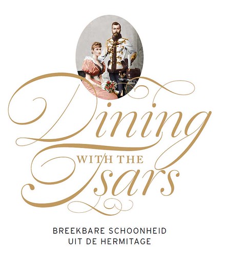
We were very pleased to find that Berry Slok Studio from Amsterdam chose our script font Dulcinea to design the poster, brochures and catalogue of the Hermitage Museum‘s exhibition ‘Dining with the Tsars’. It looks great, we hope to see soon more works from this studio.

> Read article

West Australian Symphony Orchestra identity

5 September, 2014  |   No comments

Chil3 is an Australian design studio that creates stunning works of identity and editorial design. They have recently designed the identity for the West Australian Symphony Orchestra and have chosen David Quay’s Kade as its main typeface. We love how it looks in the context of this solid design work.

> Read article

Type design collaboration with G-Star

5 September, 2014  |   No comments

We have recently worked with Renee Ramraj creating a font for the G-Star’s campaign ‘Raw for the oceans’. The alphabet plays an important part in this identity where it must reaffirm the messages behind the environmentally-conscious initiative.

> Read article