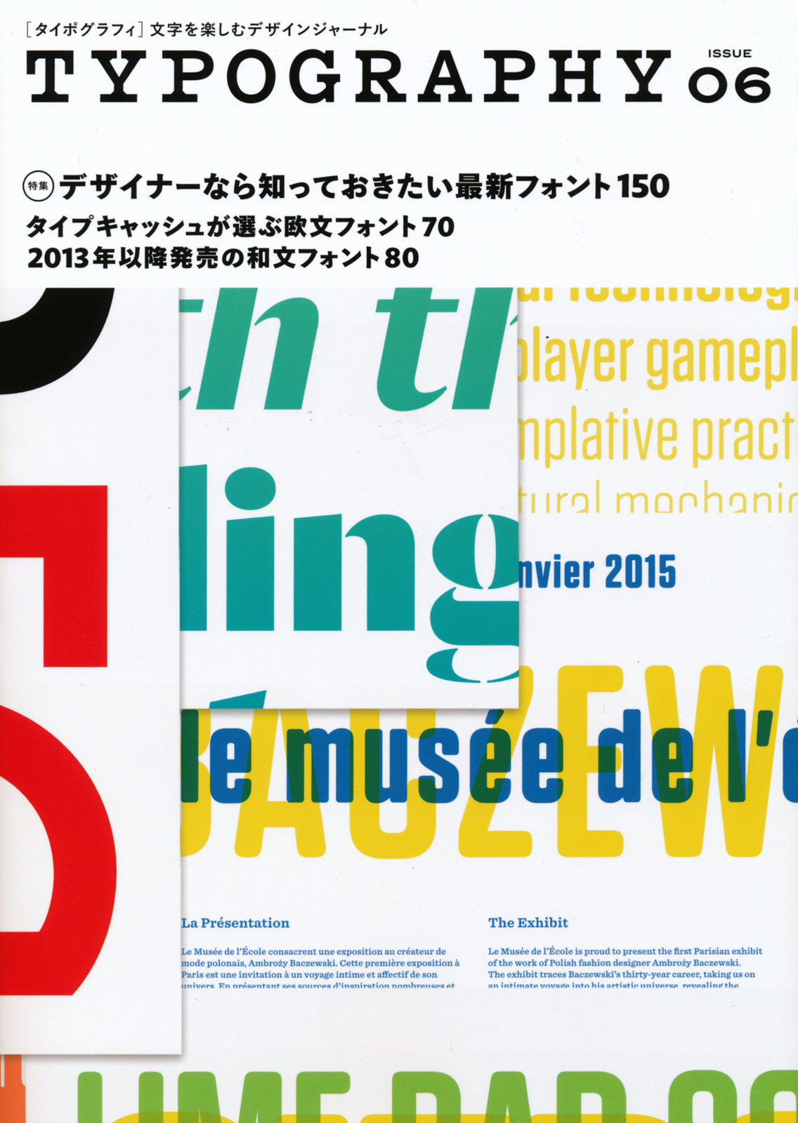
Our typeface Laski Slab has been generously featured in the Japanese magazine Typography #6. It’s a well designed publication with a careful selection of recently published typefaces and related news on typography. Thanks a lot to Yuko Miyago and his team.
… > Read article

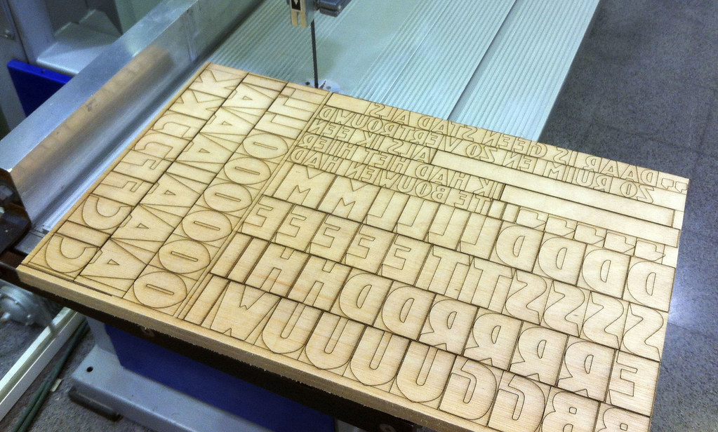
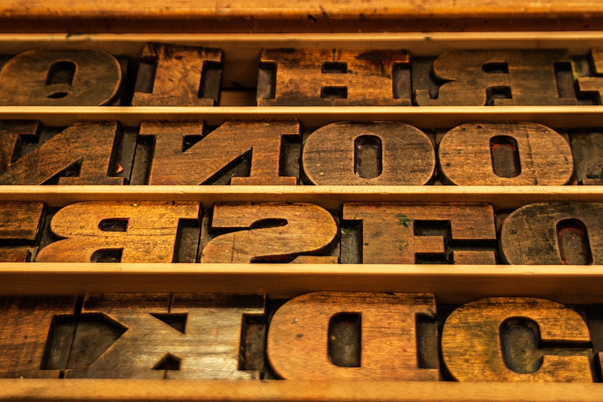
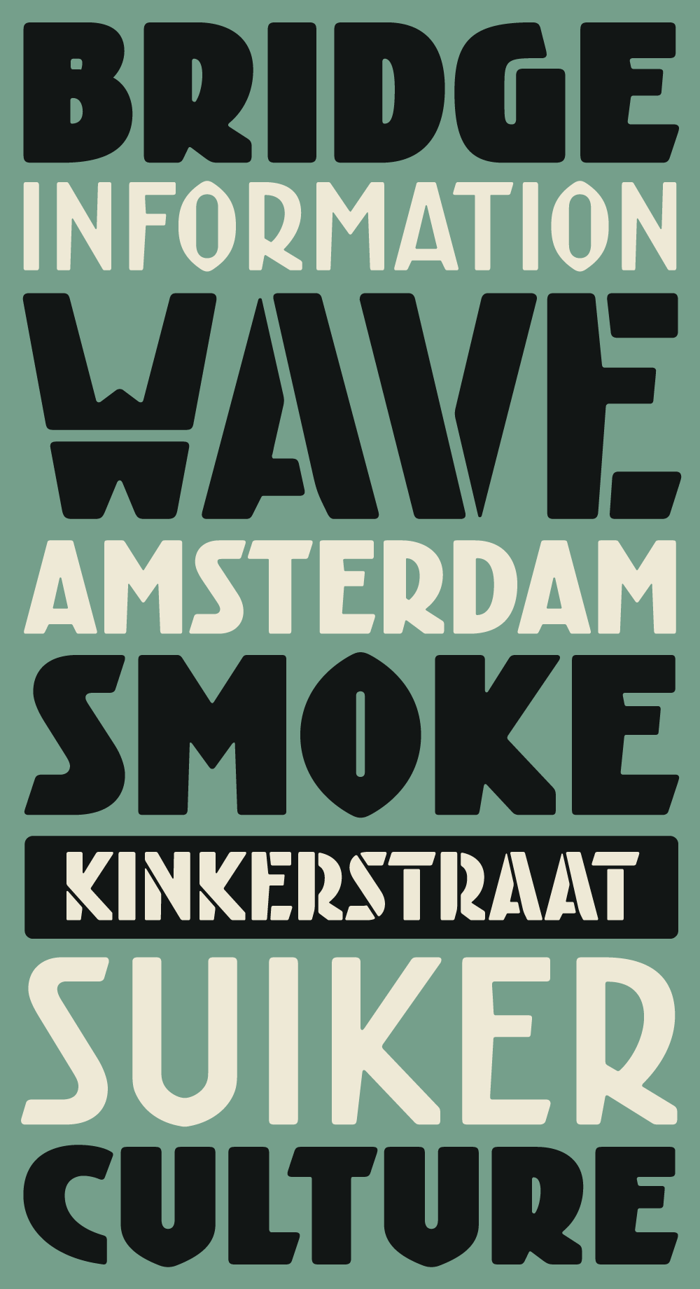
With our colleagues from Bunker Type we are planning a wood type version of Kurversbrug. Soon this new incarnation of the Amsterdam’s bridge letters (brugletter) will be ready and a set of posters dedicated to the city will be printed with them. Stay tuned for more news!
… > Read article

Few months ago we shared here some outstanding posters Richard Wolfströme designed with our Kade typeface. Now he has employed Laski Slab to design Here and Now, a magazine for The Academy of Urbanism. We think it is a beautiful piece of editorial design and we are glad our type family is playing an important rol in it. As always, thanks Richard for sharing your work with us.
… > Read article

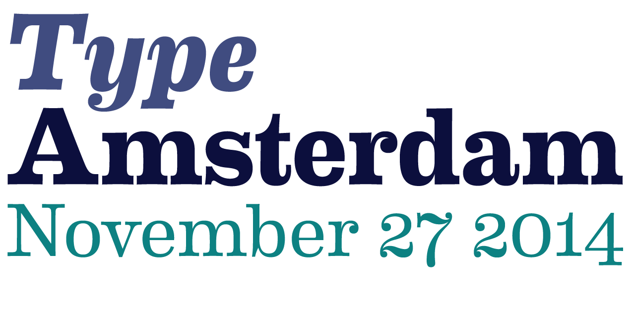
As every year the Bijzondere Collecties department of the University of Amsterdam is organizing the Type Amsterdam event. In this opportunity, the lectures will delivered by: Nina Stoessinger, Sébastien Morlighem, Huda Smitshuijzen AbiFarès and Ron van Roon.
You can subscribe in this webpage, but don’t wait too much since the venue has a rather limited capacity.
… > Read article

Kurversbrug – our interpretation of the idiosyncratic alphabet found on the bridges in Amsterdam – was the first type family released by Retype back in 2007. From the onset the Kurversbrug typefaces were very well received, and have been applied in countless design projects, websites and advertising campaigns. Even the Amsterdam municipality started using Kurversbrug in a new series of bridge nameplates. This made us realize a revamp of the family was necessary, so we began wo … > Read article
