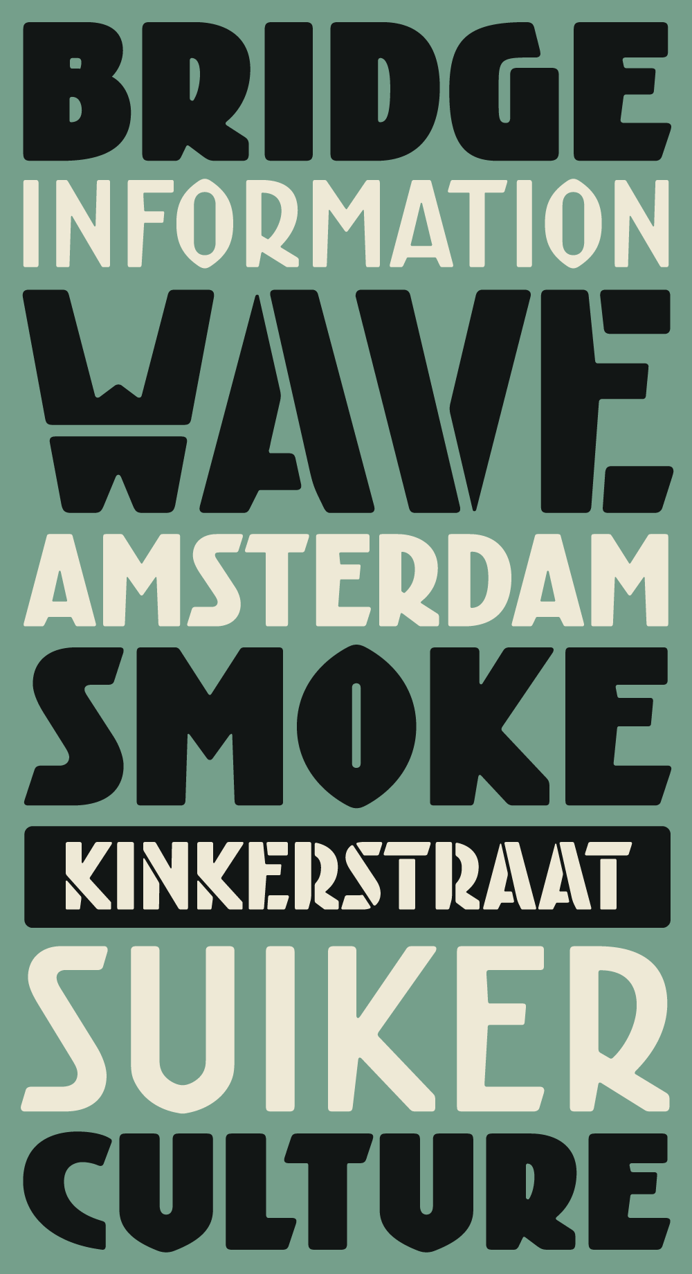
Introducing four new Kurversbrug weights
Kurversbrug – our interpretation of the idiosyncratic alphabet found on the bridges in Amsterdam – was the first type family released by Retype back in 2007. From the onset the Kurversbrug typefaces were very well received, and have been applied in countless design projects, websites and advertising campaigns. Even the Amsterdam municipality started using Kurversbrug in a new series of bridge nameplates. This made us realize a revamp of the family was necessary, so we began work on expanding the fonts and amending some details.
Today we are proud to present the new Kurversbrug type family, with four extra weights (Book, Bold, Fat and Stencil) more than doubling the family’s size. Language coverage was expanded to support all European Latin scripts. We also included alternate character shapes for ‘W’ and ‘Y’ that are faithful to the historical source of inspiration for the design.
We are confident these additions will greatly improve the Kurversbrug family, offering exciting new possibilities to designers interested in the noble tradition of the Dutch avant-garde.


Comments
No Comments Yet
You can be the first to comment!
Sorry, comments for this entry are closed at this time.