A good review in De Volkskrant
23 June, 2015 |
No comments
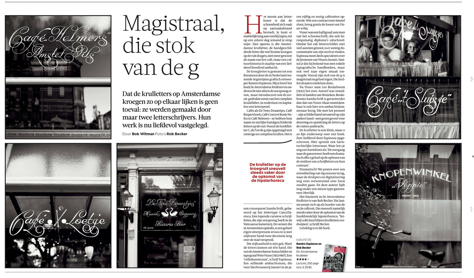
We have to admit we are terribly flattered by the very positive double page review of De Amsterdamse Krulletter that Bob Witman has published in De Volkskrant.
… > Read article