We are fans of the Amsterdam School and at least once a year we pay a visit to Het Schip, the museum dedicated to this avant-garde movement.
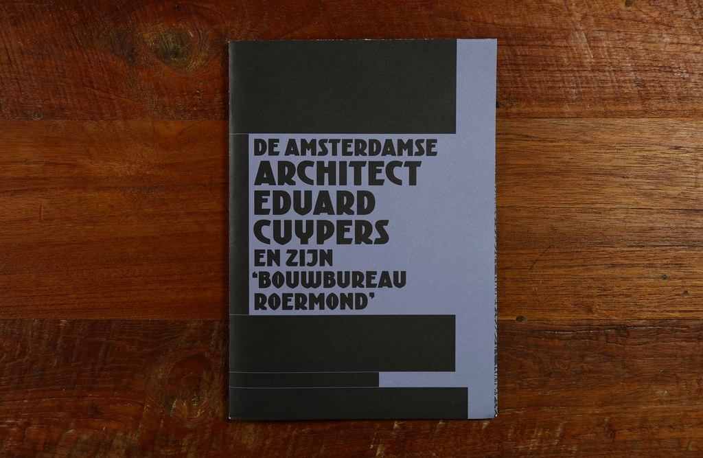
Last time we were there, we found this fine publication dedicated to the architect Eduard Cuypers. Its designer, Joep Pohlen from Polka Design chose Kurversbrug as the cover and headlines typeface and of course we think it was the right decision. 🙂
… > Read article
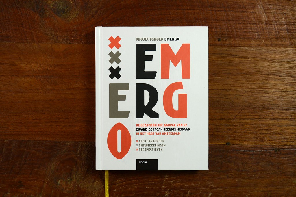
Emergo is an interesting report on Amsterdam organized crime published by Boom Publishers. The book was designed by René van der Hooren making intensive use of our font family Krurversbrug. Much appreciated, René. We love to see book designers making good use of our fonts.
… > Read article
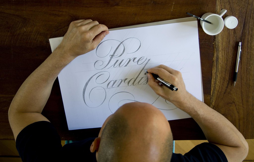
In this post at Behance you can take a look to some of the steps in the production of a recent lettering based logo. We used a copperplate style with some traits typic of the Amsterdamse krulletter
… > Read article