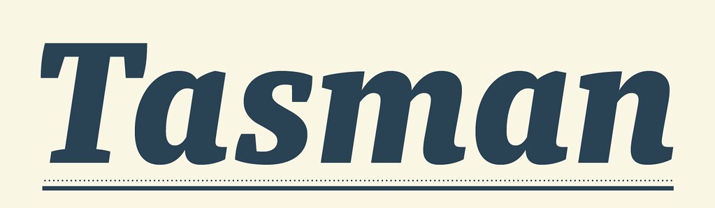
Introducing Tasman
We proudly introduce Dan Milne’s Tasman — a sturdy, warm type family that is neither mechanical nor fragile. Originally published by OurType, Tasman has found a new home at Retype.
This type family borrows its name from Abel Janszoon Tasman (1603–1659), a Dutch seafarer, explorer, and merchant who mapped parts of Australia in 1642, including Van Diemen’s Land (now known as Tasmania).
Milne first conceived Tasman as a typeface for newspapers. This influenced the proportions and look of the face considerably: the goal was to keep the personality as warm and playful as possible without losing the credible tone required to deliver all kinds of news.
Tasman’s primary purpose is an unbiased presentation of information; it strives for neutrality over elegance. Its characters are sturdy and unambiguous, sporting strong serifs, punctuation, and diacritics, as well as generously sized small caps and hybrid figures. Rationalized letterforms give the face enough robustness to withstand the stress of screen applications and laser printing. The figures’ three-quarter x-height makes them considerably larger than traditional oldstyle numerals, yet they still integrate with the lowercase much better than lining figures do.
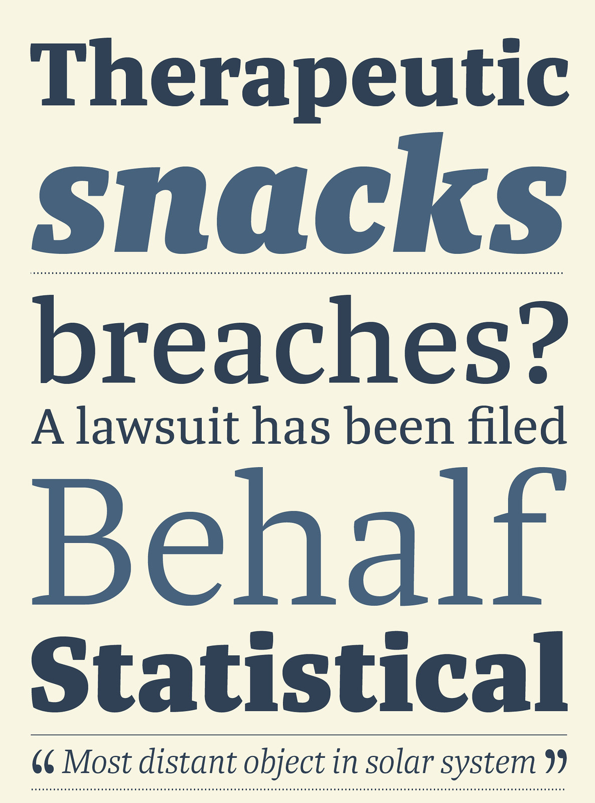
The degree of contrast between Tasman’s thick and thin strokes varies from weight to weight. The contrast of the Regular weight is typical of news faces: low enough to remain sturdy, but high enough to remain inviting for reading and to preserve a connection to the liveliness of the pen. Tasman’s bold weights maintain the lowish contrast found in the Regular, tending toward slab-serif proportions. This provides a degree of playfulness and allows the bold weights to work well when reversed out of images and solid colors.
Although initially intended for newspapers, Tasman’s somewhat corporate, objective appearance also makes it an excellent candidate for digital and print magazines, websites, annual reports, and corporate identities.
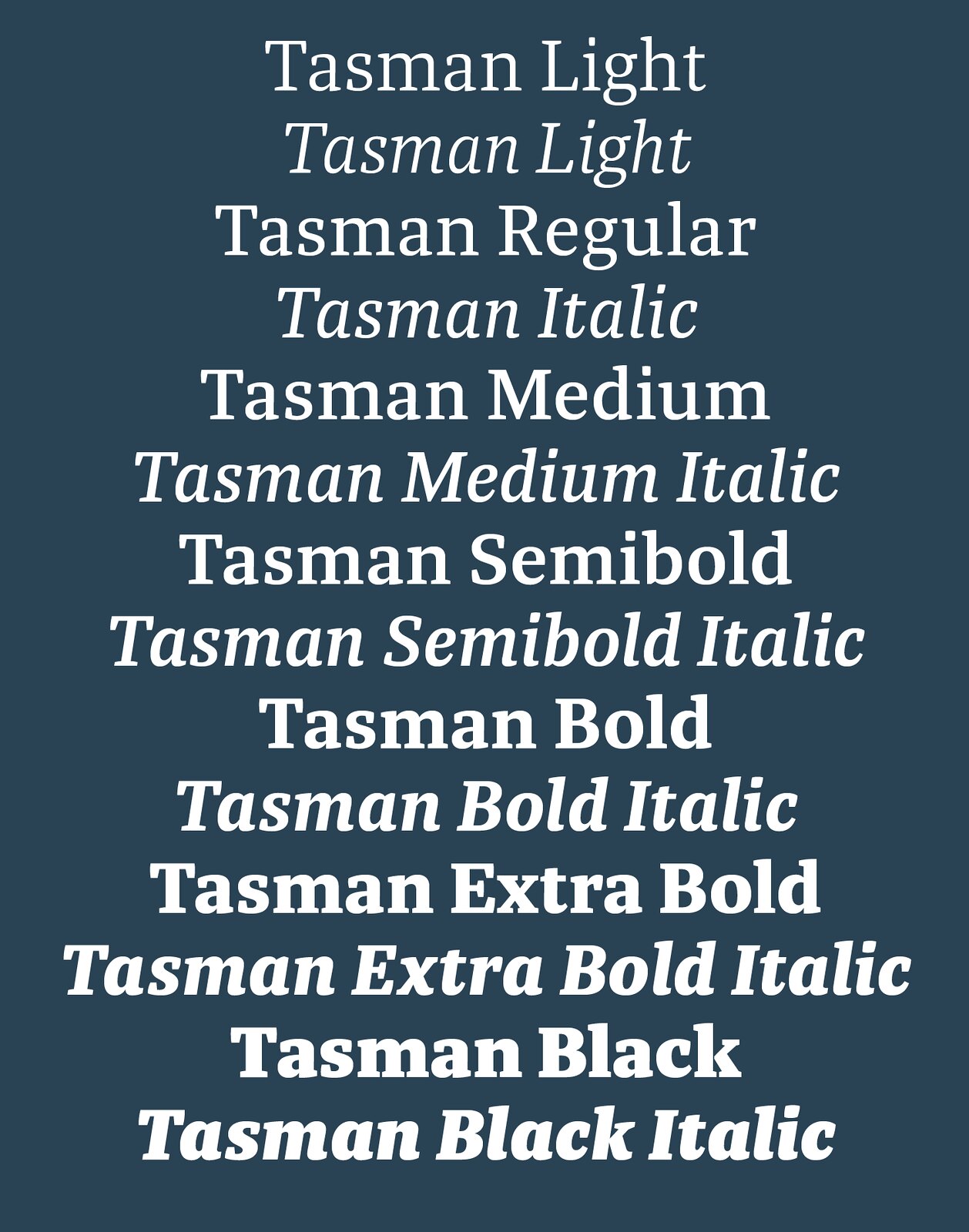
As one might expect, Tasman is a suite of feature-rich OpenType fonts fully equipped to tackle complex, professional typography. The character set includes small caps, fractions, case-sensitive forms, bullets, arrows, special quotes, and nine sets of numerals. Besides standard Latin, its extensive character set supports Central European, Baltic, and Turkish languages.
About Tasman’s designer:
Dan Milne is a type and graphic designer from Australia. He completed a Bachelor of Visual Communication at Monash University, followed by a Masters in Type Design at the Royal Academy of Art (KABK) in the Netherlands in 2009. Milne has been teaching graphic design, typography, and digital font design at Monash University since 2006. He currently lives and works in Melbourne.


Comments
No Comments Yet
You can be the first to comment!
Sorry, comments for this entry are closed at this time.