Introducing Dejanire Headline

Dejanire is a type family loosely inspired by an anonymous display typeface found in a type specimen published by Claude Lamesle, published in Paris in 1742. It takes its name from Deianira, a Calydonian princess in Greek mythology and the wife of Heracles.
The font originally introduced under the name of Gros canon deux points de gros romain was neither handsome nor elegant, suggesting that its punchcutter wasn’t a very talented artisan. In spite of this, Ramiro Espinoza saw enough alluring features in it that he decided to assign himself a design exercise: he would scrub the font of its flaws and ungainliness while preserving its genuine freshness, using it as a starting point for a new editorial family.

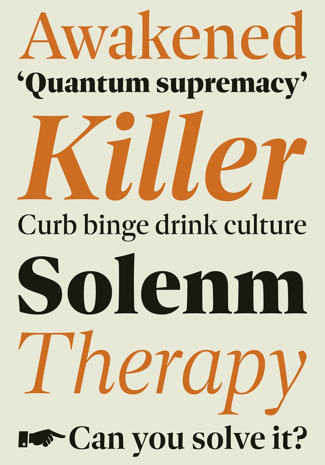
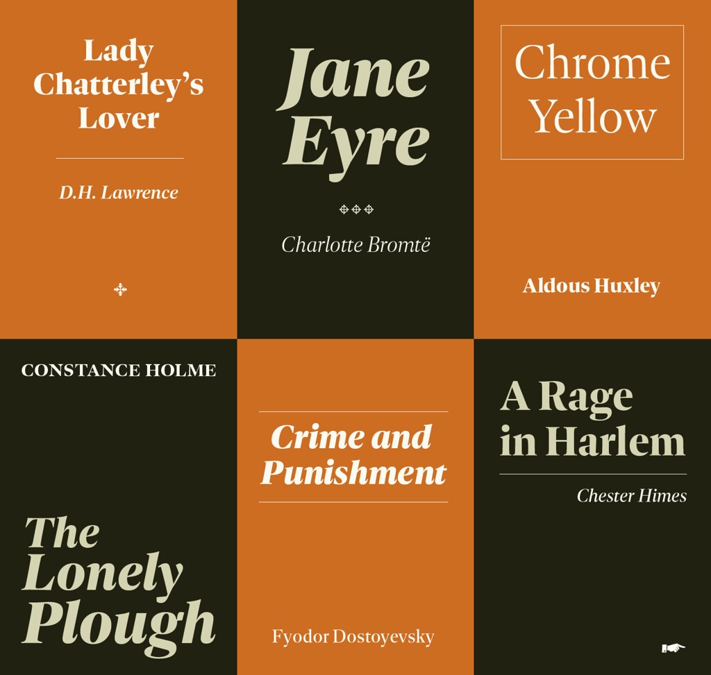
Dejanire is a transitional roman with a marked contrast and a crisp presence both in print and on screen, making it an ideal choice for robust titles, pull quotes, and decks. Although designed with magazine and newspapers in mind, the family’s clean design and readability also make it an excellent candidate for websites, annual reports, and corporate identities.
The italics were modeled after the polished, rational design introduced by Pierre-Simon Fournier, which was later adopted by Jacques-François Rosart and other eighteenth-century punchcutters.
As one might expect, Dejanire consists of twelve feature-rich OpenType fonts and is fully equipped to tackle complex, professional typesetting. Its extensive character set includes small caps, fractions, case-sensitive forms, arrows, fleurons, and seven sets of numerals. In addition to standard Latin, Dejanire Headline supports Central European, Baltic, and Turkish languages.


Comments
No Comments Yet
You can be the first to comment!
Sorry, comments for this entry are closed at this time.