Letters and bars
I confess I like bars. If they are old and peopled by old men, all the better. Me, I imagine hell as inhabited by beautiful people sipping coloured drinks at a trendy pub.
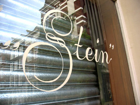
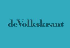
This affection led me to start looking at the pretty letters naming many of the most traditional bars in Amsterdam. They were certainly original and had been painted by the same hand for sure.
Some details were extremely original. It was a type of letter related to the formal English documents written with pointed pens (for an introduction to the best works in this style, ‘The Universal Penman’ by George Bickham is a good start). But this local variation was full of peculiar, unique details.
We can see some of them, such as the ‘knot’ of the ‘S’, in this example.
As I walked more around the city these letters appeared in other places, on other surfaces. On this cart of the traditional De Pijp Market, for instance. A “g†like that, I had definitely never seen…

So I started putting questions about the author to the owners and staff of these places.
It was no easy task. My Dutch is rudimentary, a fact which does not facilitate communication when there is beer involved and the interviewer is a buitelander (foreigner). It took me long months to find someone who could identify the sign painter. But luckily someone did and one day I found myself at Leo Beukeboom’s door explaining why I had rung his doorbell that late at night.

Leo Beukeboom was born in 1943 in the very De Pijp neighbourhood into a Catholic family. He studied typographic composition and one day following a request from his friend Adriaan Rus and without having much experience, he painted letters on the sides of a van. He gradually got more jobs and eventually became a letterschilder (letter painter).
Later Heineken brewery hired him as a letter painter to decorate the bars selling their beer. Leo Beukeboom did that from 1967 to 1989.

In Leo’s own words ‘I was born in a poor family and I am poor, but I have always earned my own money, always worked for it, I’ve been honest and I never went whoring nor led a dissolute life’.

When I asked him about his influences, Leo said he thinks the work of Jan Van de Velde, the wonderful Dutch calligrapher, has been his biggest inspiration. Here is an example of this Master of Letters.

Beukeboom’s gorgeous letters with plenty of swashes and intricate details are mesmerizing and the possibilities brought by new technologies like OpenType typography gave them a new life in digital format.
I finish this piece in the wee hours with the picture of his box of brushes in my mind, the box he took with him to work on his scooter, still in a cupboard in his home as if keeping him company.
*Note: A complete book on the subject “Amsterdam’s Krulletters” can be ordered here.


Comments
No Comments Yet
You can be the first to comment!
Sorry, comments for this entry are closed at this time.