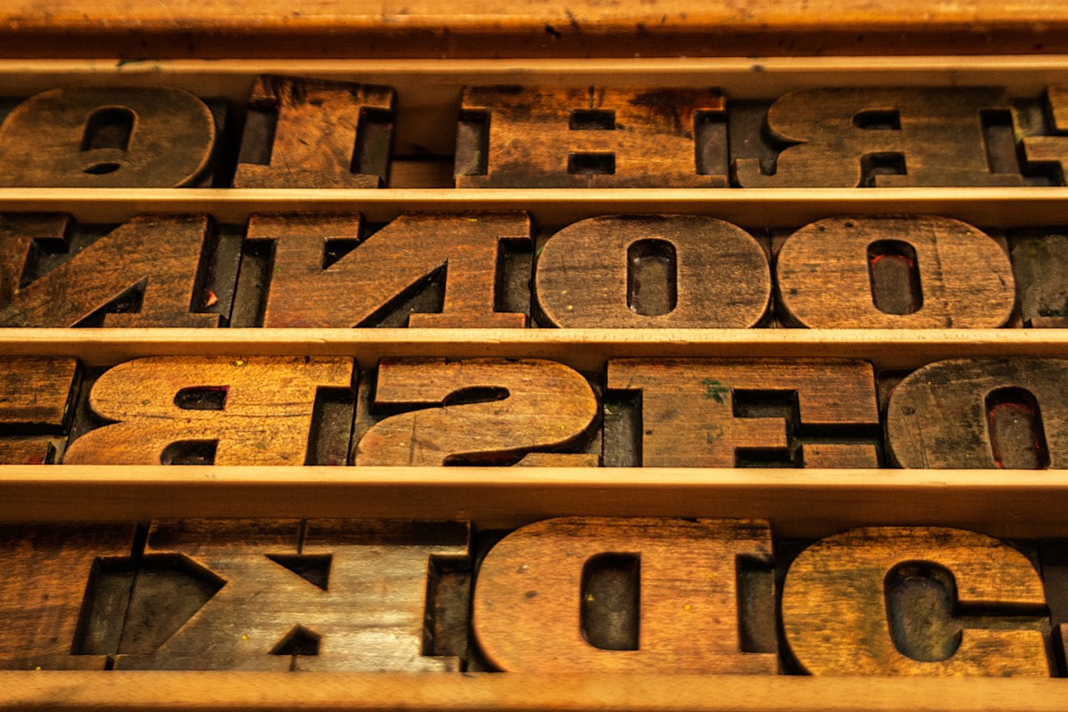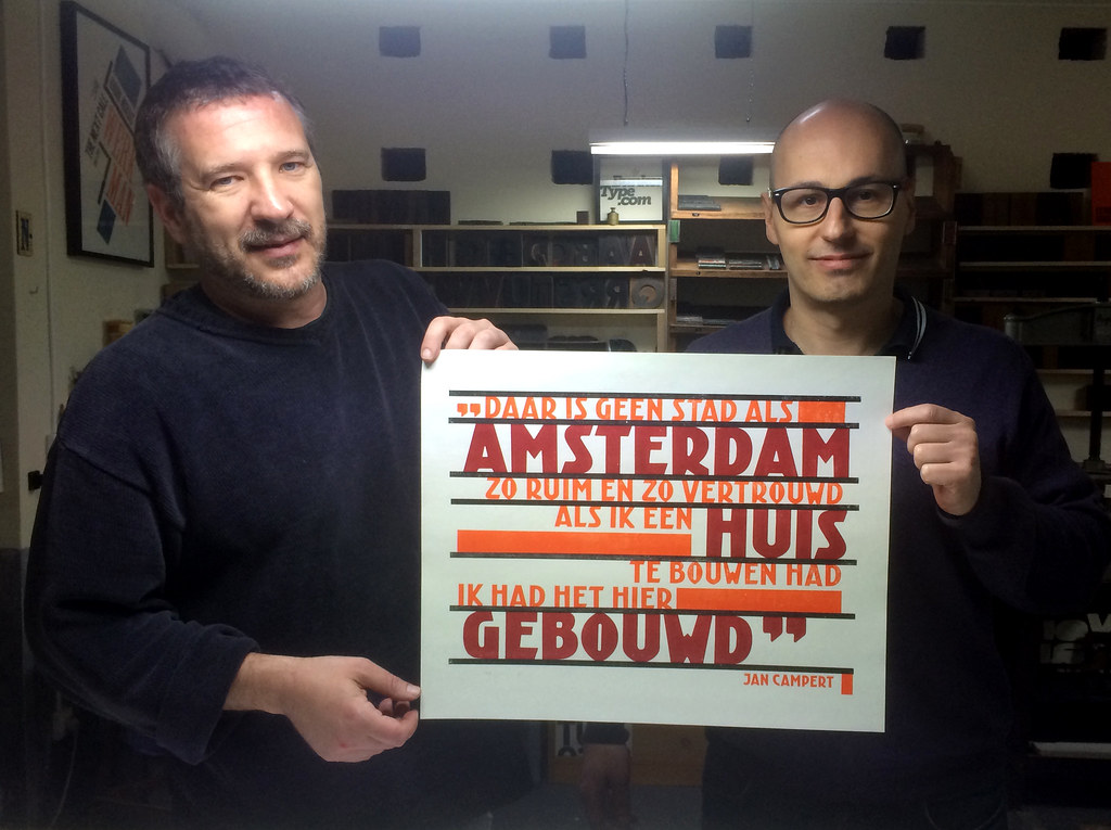
We have been experimenting with our friends of BunkerType with a wood type version of Kurversbrug, the revival of Amsterdam’s bridge letters. We chose a fragment of a famous poem by Jan Campert (“Een Amsterdamsch lied”) and with it a poster in the spirit of The Amsterdam School avant-garde was designed and printed. Stay tuned, the poster will be made available soon.
… > Read article
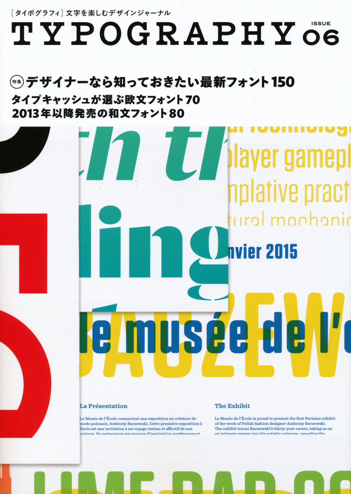
Our typeface Laski Slab has been generously featured in the Japanese magazine Typography #6. It’s a well designed publication with a careful selection of recently published typefaces and related news on typography. Thanks a lot to Yuko Miyago and his team.
… > Read article
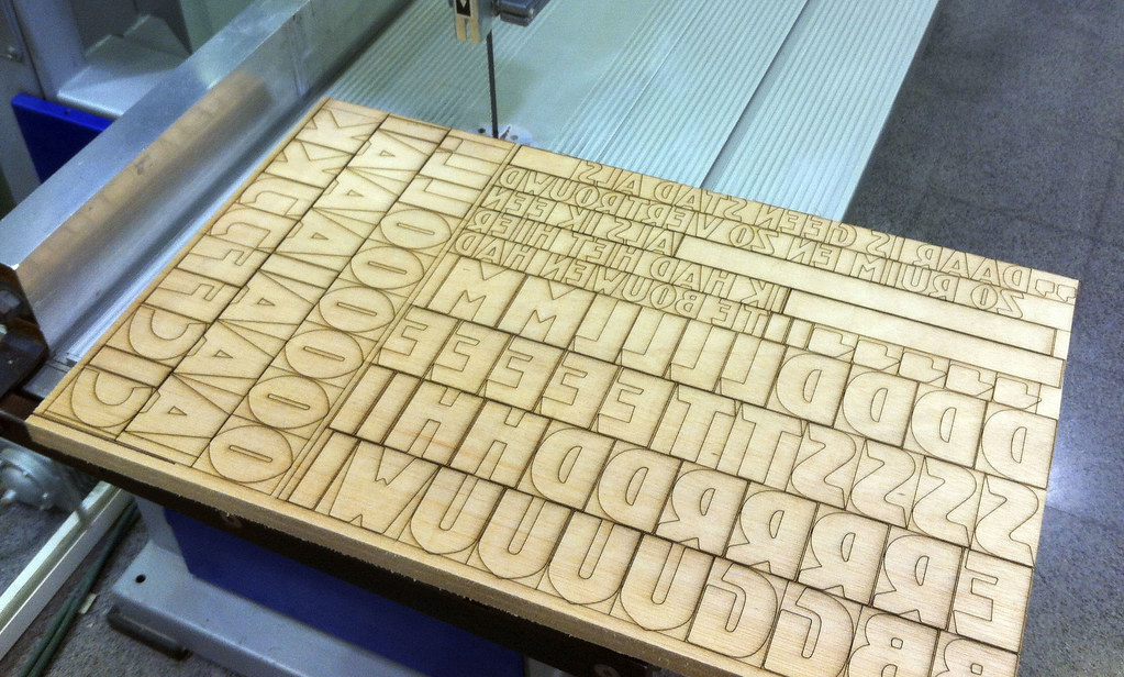
With our colleagues from Bunker Type we are planning a wood type version of Kurversbrug. Soon this new incarnation of the Amsterdam’s bridge letters (brugletter) will be ready and a set of posters dedicated to the city will be printed with them. Stay tuned for more news!
… > Read article

Few months ago we shared here some outstanding posters Richard Wolfströme designed with our Kade typeface. Now he has employed Laski Slab to design Here and Now, a magazine for The Academy of Urbanism. We think it is a beautiful piece of editorial design and we are glad our type family is playing an important rol in it. As always, thanks Richard for sharing your work with us.
… > Read article
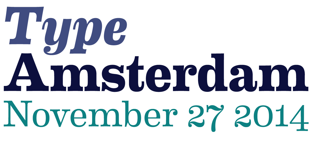
As every year the Bijzondere Collecties department of the University of Amsterdam is organizing the Type Amsterdam event. In this opportunity, the lectures will delivered by: Nina Stoessinger, Sébastien Morlighem, Huda Smitshuijzen AbiFarès and Ron van Roon.
You can subscribe in this webpage, but don’t wait too much since the venue has a rather limited capacity.
… > Read article
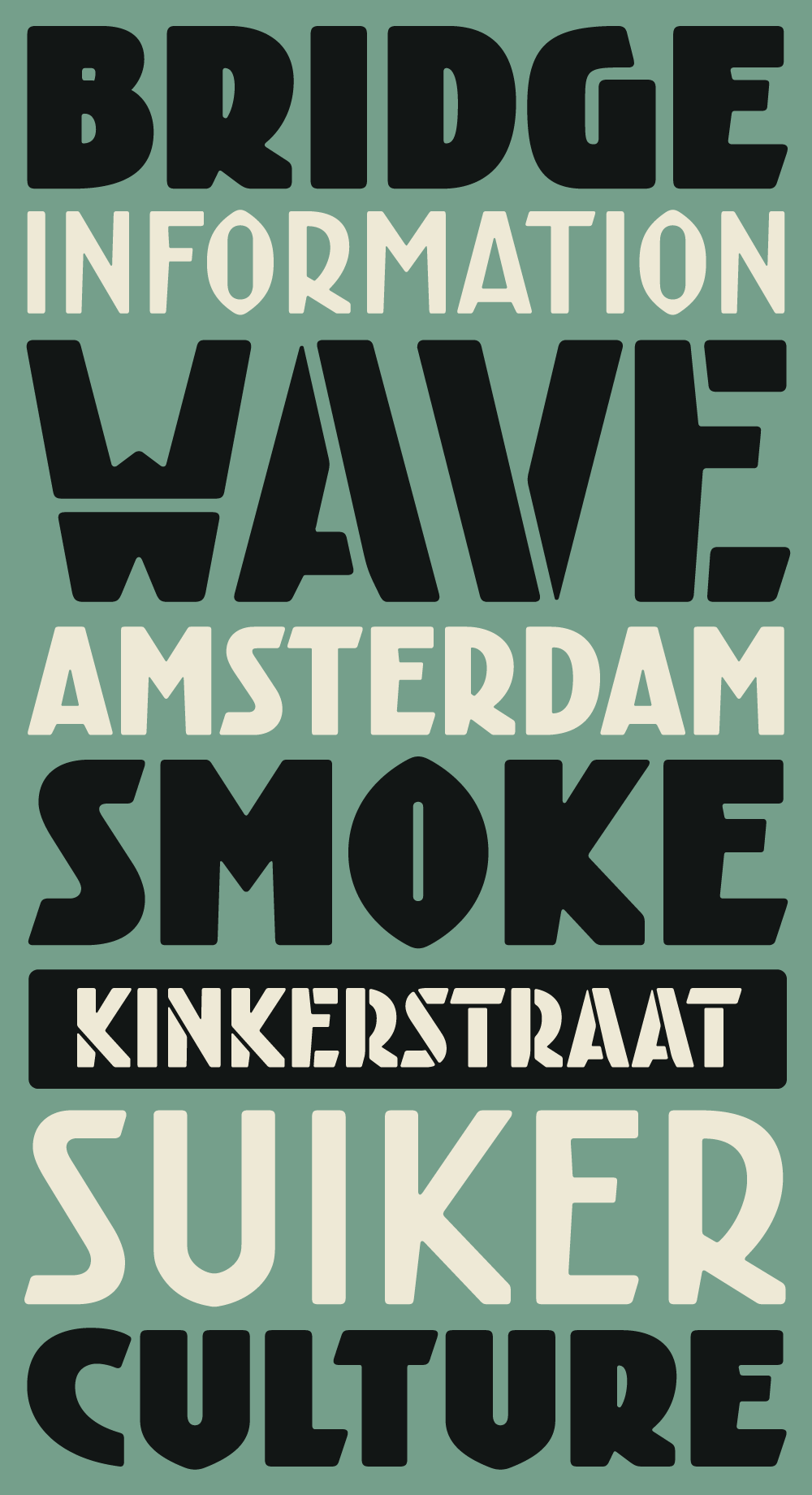
Kurversbrug – our interpretation of the idiosyncratic alphabet found on the bridges in Amsterdam – was the first type family released by Retype back in 2007. From the onset the Kurversbrug typefaces were very well received, and have been applied in countless design projects, websites and advertising campaigns. Even the Amsterdam municipality started using Kurversbrug in a new series of bridge nameplates. This made us realize a revamp of the family was necessary, so we began wo … > Read article
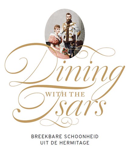
We were very pleased to find that Berry Slok Studio from Amsterdam chose our script font Dulcinea to design the poster, brochures and catalogue of the Hermitage Museum‘s exhibition ‘Dining with the Tsars’. It looks great, we hope to see soon more works from this studio.
… > Read article
Chil3 is an Australian design studio that creates stunning works of identity and editorial design. They have recently designed the identity for the West Australian Symphony Orchestra and have chosen David Quay’s Kade as its main typeface. We love how it looks in the context of this solid design work.
… > Read article
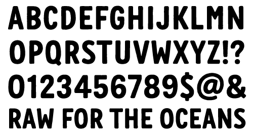
We have recently worked with Renee Ramraj creating a font for the G-Star’s campaign ‘Raw for the oceans’. The alphabet plays an important part in this identity where it must reaffirm the messages behind the environmentally-conscious initiative.
… > Read article
Finnish designer Tom Backström from mustakirahvi.net has designed this stunning book jacket with our typeface Winco. It looks great Tom, thanks a lot for letting us know about it!
… > Read article
For those type lovers who prefer the smell of printed specimens, we’ve made a Laski Slab booklet displaying every weight and showing their potential with a variety of design examples. It can be ordered here.
… > Read article

Bas van Vuurde is a talented graphic designer and typographer who runs a studio in the city on Haarlem. He has recently designed a graphic identity for “De Vrijplaats” (a rehabilitation center). We are glad to see again Kade as one of the central elements of a very well balanced identity.
… > Read article
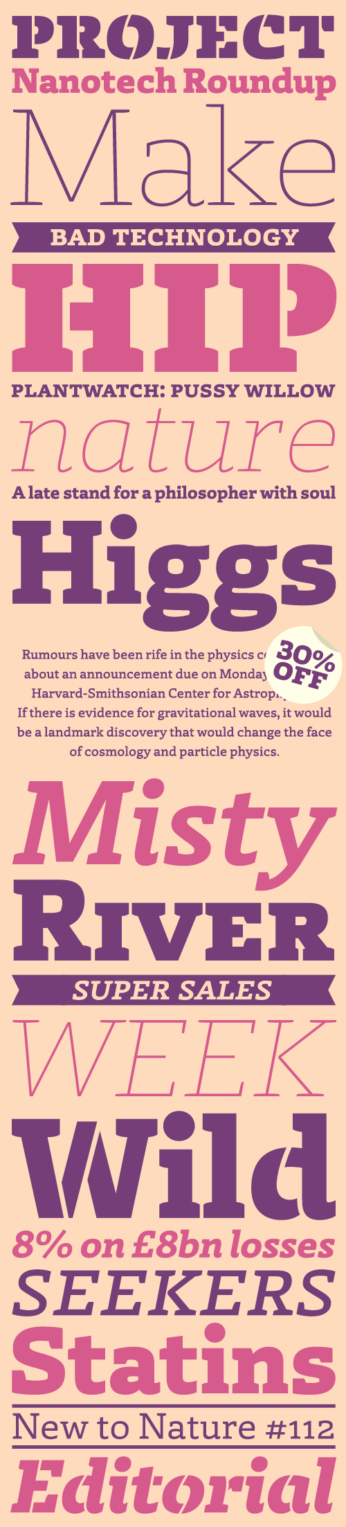
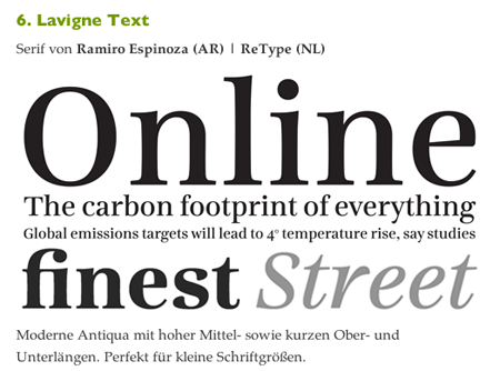
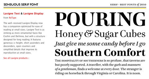
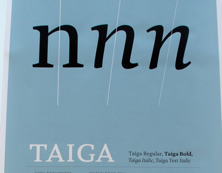
ReType Foundry proudly introduces Laski Slab, a comprehensive suite of 20 fonts conceived for editorial purposes. The type family was designed by Paula Mastrangelo, an Art Director with extensive experience in editorial design specialized in corporate communication. Originally developed for an online children’s magazine, Laski was expanded into a multipurpose type family with the technical assistance of Ramiro Espinoza.
Belying the intrinsic robustness of the slab serif genre, L … > Read article
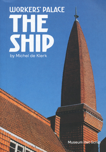
The Amsterdam School Museum in Amsterdam has published a beautiful book featuring our font Kurversbrug in the cover and titles. The book, designed by Rutger Vos, is dedicated to one of its more important milestones: Het Schip (The Ship). This building marks the highest point of socialhousing in the Netherlands. There, workers were not only provided with good quality accommodation, but they were also given a beautiful home. So, if you ever travel to Amsterdam, forget about silly … > Read article


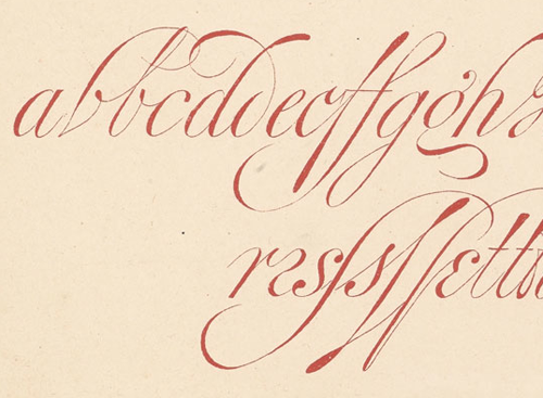
New from ReType, Medusa is Ramiro Espinoza’s homage to one of the most renowned masters of Spanish calligraphy, Ramón Stirling, who was active in Barcelona during the 19th century. Not much is known about his life, and there is even some doubt as to his real name, but his Bellezas de la Caligrafía (Beauties of Calligraphy) is one of the most exquisite English roundhand manuals ever produced.
The starting-off point in the creation of the typeface was an analysis of the histor … > Read article

Next week is Type Amsterdam 2012. We are very exited and – certainly – a bit nervous 🙂
See you on Thursday.
… > Read article
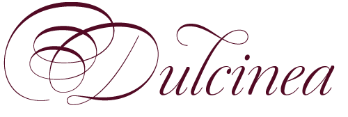
Dulcinea is the title of Ramiro Espinoza’s in-depth look at Spanish Baroque calligraphy’s most extreme tendencies, and especially at some of those produced by the writing masters Pedro Díaz Morante and Juan Claudio Aznar de Polanco. These 17th and 18th centuries alphabets with their plentiful calligraphic flourishes represented a marked break with the harmonic and angular Renaissance Cancellaresca style.
It was Morante who first introduced and popularized the use of the poin … > Read article

Super font promo: during July you can buy at re-type.com the font families Kade and Winco with a very convenient 50% discount. Stay tuned for more interesting offers!
… > Read article

Studio Frog Design has released a nice promotional video featuring our Kurversbrug font combined with Underware’s Bello. Kurversbrug’s contours looks quite distorted like after being autotraced, which is a bit weird but… who cares!
… > Read article
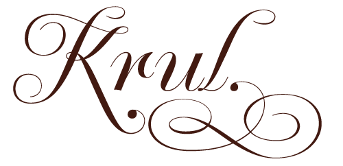
‘Krul’ is a typographic interpretation of the lettering style created by Dutch letter painter Jan Willem Joseph Visser at the end of the 1940s, which decorated the traditional brown bars of Amsterdam. In the beginning, these letters were strongly associated with the pubs connected to the Amstel brewery, given that Visser was the company’s official painter. As the years passed, the style became increasingly popular, and various business owners in Amsterdam and other Dutc … > Read article
Winco family can be labelled a humanist sans-serif, but in spirit it is more closely related to that rather rare typeface category called ‘glyphic’ or ‘incise’. Glyphic faces occupy a place roughly half-way between seriffed renaissance book faces and sans-serifs. The classic examples are Optima (Hermann Zapf) and Albertus (Berthold Wolpe), with Pascal (José Mendoza) sometimes mentioned as a more calligraphically inspired cousin to Optima. Instead of serifs, these types h … > Read article
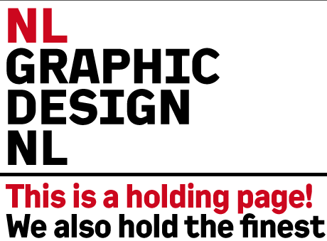
Our font family Kade has been chosen by NL Graphic Design as the headline font for their new website. NL Graphic Design has grown out of the antiquarian department of Nijhof & Lee International Booksellers, and has one of the finest collection of original Dutch posters, catalogues, and books on typography available for sale. As Kade is bold and robust, we find it very well suited for this clean layout.
… > Read article
As every year I attended the Type]Media exhibition at the KABK in The Hague. It was nice to chat with the new graduates and learn about their projects and researches. Afterwards, there is always an alumni meeting and despite the dinner was not very well served thanks to a rather messy restaurant 🙂 , nobody actually cared much. Good company and juicy conversations were enough to keep everyone satisfied.
I made a Flickr’s Group with all the Type]Media’s posters but … > Read article

We just got the new Bath’s maps and they look great. Thanks FWDesign!
… > Read article
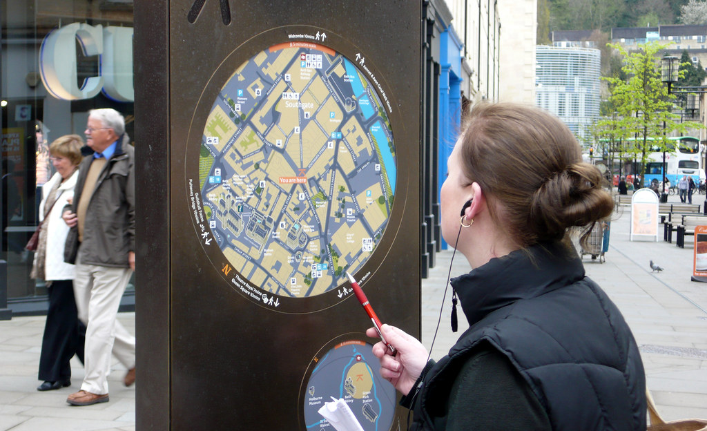
More pictures of Bath’s new signage system have arrived. Higher resolution images can be found here.
… > Read article

When, in 2010, David Quay was asked by communication agency FWDesign to create a custom type family to be used as the new signage and orientation system of the City of Bath, he teamed up with ReType.
Bath is a beautiful city to design for, and we were delighted to be involved in the project. The process was intensive, and demanded a well-documented research into local values, history, and vernacular lettering tradition. We didn’t want a ‘squarish’ sans with a &# … > Read article

The Hague uses an interesting and original alphabet style in its street naming. It’s a typical ‘technical’ design, characterised by repetition of the same modules, and according to Albert-Jan Pool, related to DIN standards. Despite the ingenuity of its obvious typographic quirks, we like it; it’s part of the The Hague’s graphic and cultural DNA. For that reason, during our long wait for a new internet connection (thanks KPN!), we made up a digital ve … > Read article
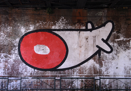
I haven’t found as many graffitis in Buenos Aires as in the past, but anyway there are some good ones. This is located under a bridge in the intersection of ‘Crámer’ and ‘Elcano’ avenues. Check the artist’s website TEC and his Flickr account.
… > Read article
Being on vacation in Buenos Aires, I find impossible not to spend time spotting local lettering. This is the first batch.
… > Read article
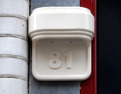
On the Eerste Jan Steenstraat, in the Amsterdam neighbourhood of De Pijp, a group of houses has been renovated with their house numbers set in ornamental ceramic plates. We are gratified that, once again, our ‘Brugletter’ revival, Kurversbrug is being used in such a prominent position, and hope to see more of these plates in the streets of Amsterdam. Keeping alive Amsterdam’s best examples of letter-making tradition is one of our objectives, so we love to disco … > Read article
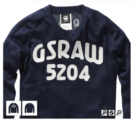
The leading fashion brand G-Star, in exploring the rich heritage of the dutch avant-garde has elected to use our font Kurversbrug in printed designs on their jackets and sweaters. We agree that the sturdy aesthetics of the ‘Amsterdamse School‘ architects is a perfect accompaniment to urban street-wear, and are delighted with their choice.
… > Read article
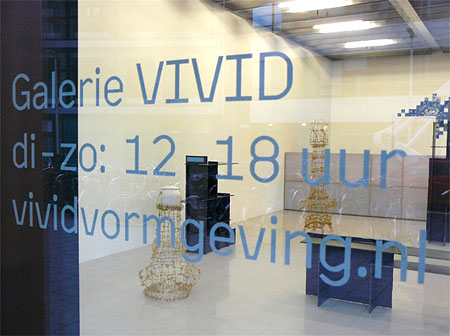
Vivid Gallery is a design gallery situated in the heart of Rotterdam. Founded by Saskia Copper and Aad Krol, they have recently chosen to use Kade for all their communications. A perfect type for an institution devoted to highlight the best in dutch design innovation.
… > Read article

It seems like ‘Kurversbrug‘ is becoming quite popular. This time we spotted it in this nameplate used to identify a boat-house on the Amstel River in Amsterdam. Good election! 🙂
… > Read article